If this is your first visit, be sure to
check out the FAQ by clicking the
link above. You may have to register
before you can post: click the register link above to proceed. To start viewing messages,
select the forum that you want to visit from the selection below.
Wow...looks like my 1st grader could have done better. Like the original poster stated, it may eventually grow on me.
what the video. some interesting decoding symbols on the other side of the barrell.
Regards,
Joel S.
joelsabi @ gmail.com Wanted: Alex Rodriguez Game Used Items and other unique artifacts, 1992 thru 1998 only. From High School to Early Mariners.
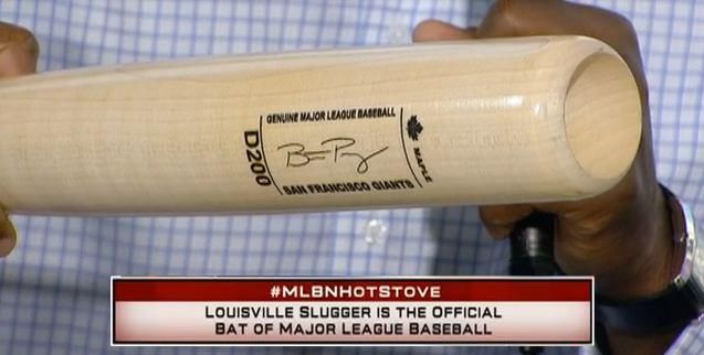
Coming from a designer who does product branding, I think this design was a step backwards and sad to see. They remind me of the "Turn Ahead the Clock" uniforms... and not in a good way.
The old LVS had tradition, this looks like it's aping the worst features of the competition... It would have been a creative goldmine to rework these bats for the future while retaining the long LVS tradition and this is what they came up with?
These look like a cross between a commemorative bat and some of the modern bats (like Trinity or X-Bat) that haven't really found a specific branding look yet and are just bland. Also, nothing looks burned-in, I'm assuming it's all foil stamped or screened on now...
I like the idea of the icons showing what the bat specs are, but think this should have been on the knob or the barrel end, no reason to emphasize these.
It seems like they're making these unnaturally futuristic with the icons and the overall framed look. I'm assuming someone made a comment that the old bats looked too old or outdated and LVS went too far in the other direction.
An iconic brand like Louisville Slugger should maintain a traditional look with only minor tweaks. The Yankees have been pretty successful going that route.
An iconic brand like Louisville Slugger should maintain a traditional look with only minor tweaks. The Yankees have been pretty successful going that route.
one thing they kept is the center brand look so there is some consistency over time. i agree. why fix it if it aint broken.
the end brand looks different and may grow on me. other bat companies may copy them. at least LVS are the first with the look. When Reynolds said it looked like a baseball card, the first thing that came to my mind was the card companies are going to cut the entire end brand off and put it on a baseball card.
the "dot on the handle" and compression explanation was really interesting.
Prices of Posey and Longoria bats may go up based on the statement made on the video.
Regards,
Joel S.
joelsabi @ gmail.com Wanted: Alex Rodriguez Game Used Items and other unique artifacts, 1992 thru 1998 only. From High School to Early Mariners.
I wonder if the marketing people at LVS were smart enough to take a survey of the players who uses their bats? If they did I am pretty sure that the players would say "HECK NO!", I surely would.
So, they are doing away with the 125 in the centerbrand? are there other things we need to look for now to tell the difference between retail and pro model?
Like the others have said, I'm not a fan of the new sig block. Louisville Slugger is iconic. It should be tweaked, not transformed. I think this will be short lived.

 Tweet
Tweet


Comment