
 Tweet
Tweet
Re: Post Your Photo-matched Game-used Items Here
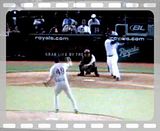
2007 Alex Gordon GU rookie bat PHOTO matched used against the Yankees

and now the match:


another view


ball marks: (he went 3/4 on July 24th and 1/4 July 25th when he broke the bat)

2007 Alex Gordon GU rookie bat PHOTO matched used against the Yankees
and now the match:
another view
ball marks: (he went 3/4 on July 24th and 1/4 July 25th when he broke the bat)


Comment