


Results 1 to 10 of 34
-
08-16-2011, 12:46 AM #1Junior Member

- Join Date
- Aug 2011
- Posts
- 20
A Study of the Baltimore Orioles Cartoon Bird Cap Logos
Hey everyone,
I originally created this thread over at Chris Creamer's Sports Logos site, but I thought I'd post highlights of it here, to see if anyone has any extra info to add.
Here's the link to the original thread:
http://boards.sportslogos.net/index....pic=81874&st=0
One more thing to add, I learned a few things as I was adding to the original thread, so there is info in the first post that is corrected in later posts. I'm too lazy to re-organize everything, so I'm just going to post the main posts here, in the order that they were posted.
-
08-16-2011, 12:46 AM #2Junior Member
- Join Date
- Aug 2011
- Posts
- 20
Re: A Study of the Baltimore Orioles Cartoon Bird Cap Logos
My favorite team, the Baltimore Orioles, haven't had a winning season since 1997, so lately I've shifted my attention to my favorite logo of all time, The Cartoon Bird. That friendly, smiling, feathered character that perched atop the caps of the Orioles from 1966-1988. But don't let his friendly smirk and soft feathers fool you, he will show no mercy.
During The Birds 23 year tenure, the O's had 19 winning seasons, including 8 Playoff and 6 World Series appearances. The Orioles were the winningest team in all of baseball during the span that The Cartoon Bird donned their caps. If they weren't in it, they were damn close.
OK, enough with Baltimore's long gone winning baseball history, lets get to the actual cap and it's famous logo:
There are actually 3 different versions of The Cartoon Bird cap logo. There are only 2 posted on this site, which is what prompted me to write this post.
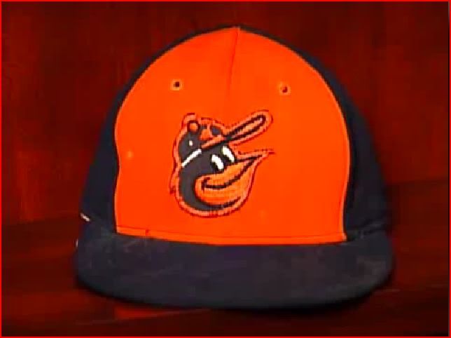
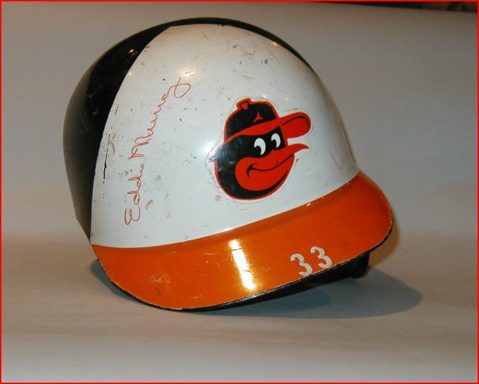
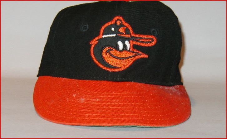
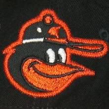
First, the 1966 cap:
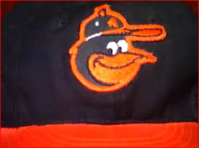
Classic Cartoon Bird logo on black hat, with orange bill. They used this cap from 1966-1974. It is represented on this site with this beautiful rendition:
The only difference I notice between the actual cap logo and this image, is the button on top of the cap is rounded off at the top. On the actual cap, the button is angular, almost a triangle shape.
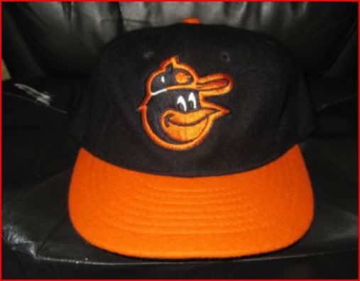
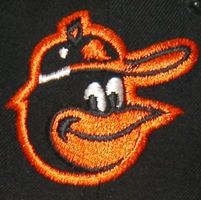
I've seen this bird used on past replica hats, but for some reason the button on the birds cap was left black and not colored orange. Here is a KM Pro/Mitchel & Ness replica of this cap:
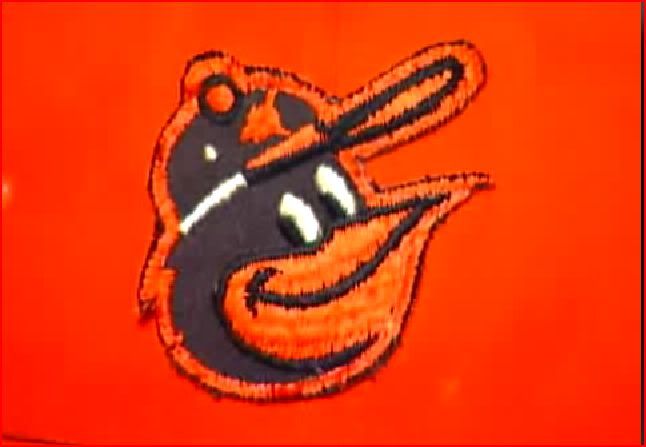
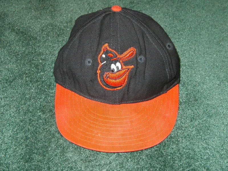
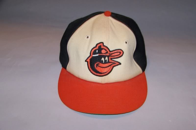
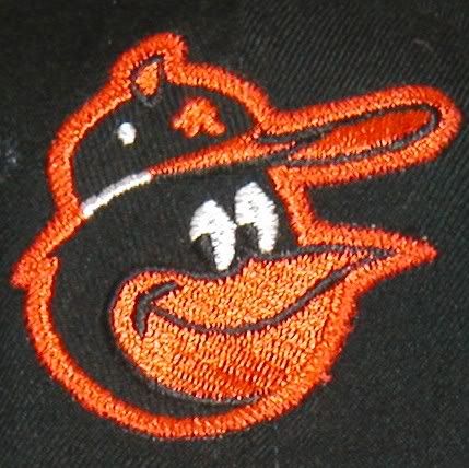
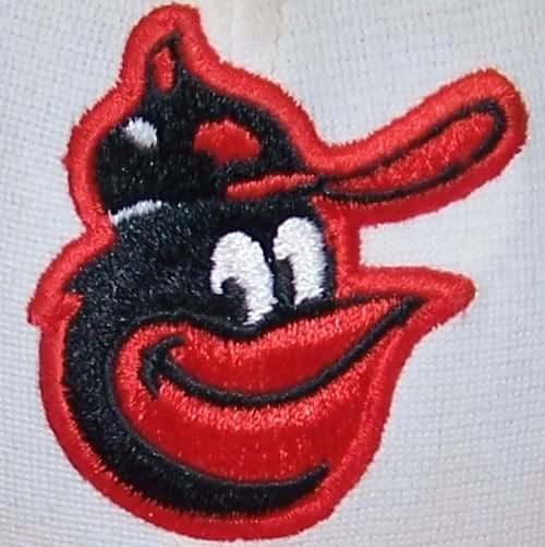
In 1975, the Orioles added white panels to the front of the hat and introduced a new bird. The forgotten Cartoon Bird:
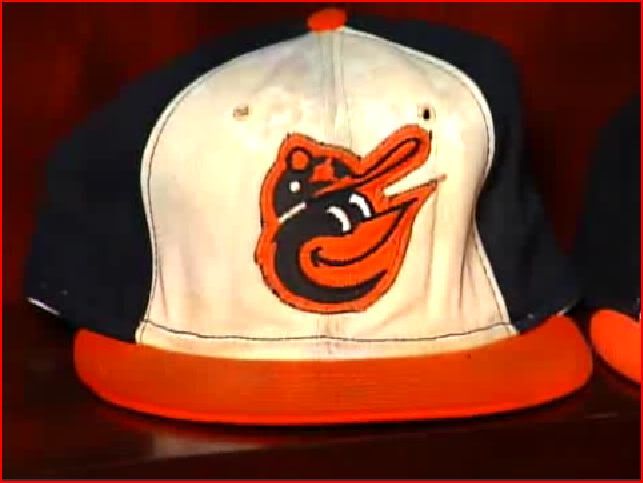
The birds beak is tilted higher upward and there are slight differences in the eyes, button and logo on his cap. There is also black stitching around the white panels.
They also used this bird on an orange paneled cap that was used as an alternate from 1975-1976:
I've never seen this bird represented correctly on any replica caps. He's represented on this site with this image, which is not also not correct:
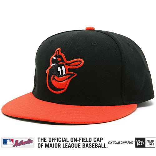
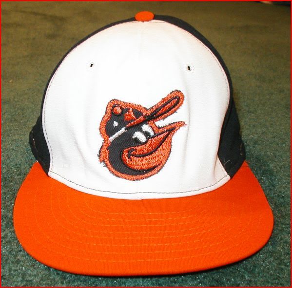
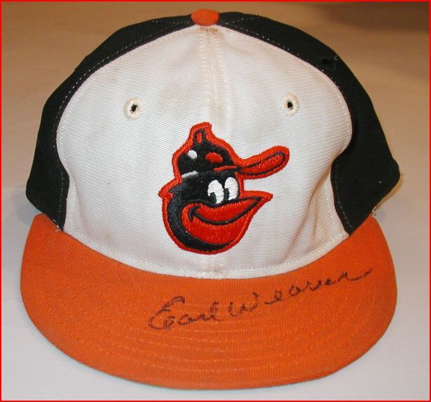
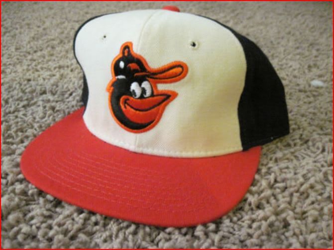
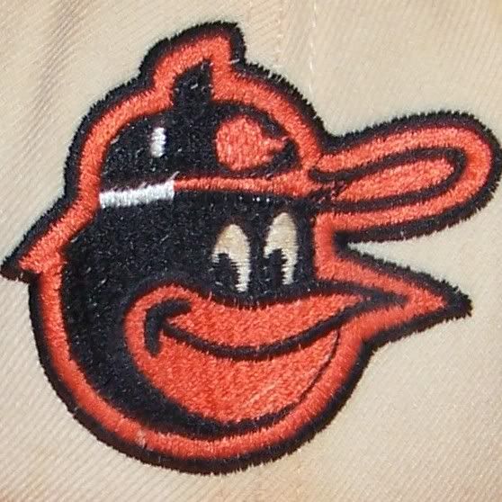
Moving onto 1977, they continued with the white panels (minus the black stitching) and reduced the size of the bird:
The O's would wear this cap through the 1988 season.
Here's the image from the site:
Everything looks good, except for the logo on the birds cap, which is supposed to be orange, not white. I often see replicas, with the white logo instead of orange, as well.
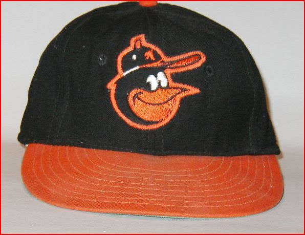
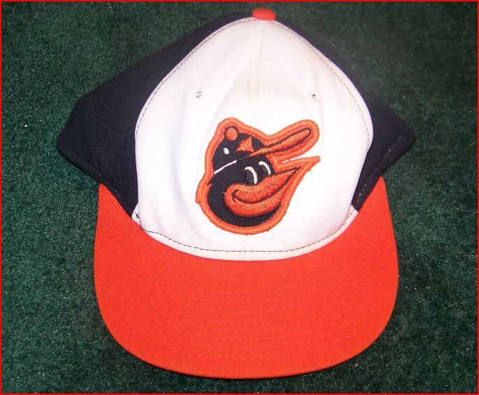
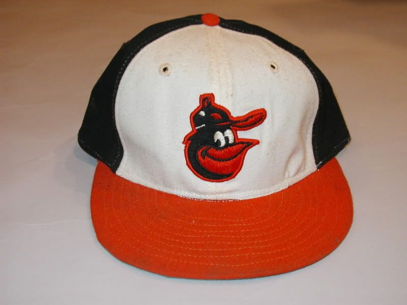
This is the bird we see on all replica caps and merchandise today. It has taken the place of the '66-'74 bird, as illustrated by this recent, authentic, on-field, turn back the clock model:
It's also used on the '75-'76 orange panel replica:
http://i131.photobucket.com/albums/p...artoon75-1.jpg
Well, there you have it, everything I know about the 3 variations of The Cartoon Bird. Rumor has it that the Orioles will bring him back on the caps officially next year. I wonder which version they will use?
-
08-16-2011, 12:47 AM #3Junior Member
- Join Date
- Aug 2011
- Posts
- 20
Re: A Study of the Baltimore Orioles Cartoon Bird Cap Logos
-
08-16-2011, 12:48 AM #4Junior Member
- Join Date
- Aug 2011
- Posts
- 20
Re: A Study of the Baltimore Orioles Cartoon Bird Cap Logos

-
08-16-2011, 12:49 AM #5Junior Member
- Join Date
- Aug 2011
- Posts
- 20
Re: A Study of the Baltimore Orioles Cartoon Bird Cap Logos
[quote name='NDwas' timestamp='1312482354' post='1607884']
As a die-hard Orioles fan since birth, I've always wondered why there were so many inconsistencies between the bird logos.[/quote]
Good post, NDwas. I never noticed those details in the swinging bird. With the current cartoon cap logo, I figured they were trying to standardize and just narrow it down to one bird face, but then you see the bird they release officially, on the new, authentic/on-fild, TBTC cap and it's different still.
Furthering my research on the actual cap logos, I came across an auction site that has a ton of game used O's gear from the '50's through present:
http://www.parkwaypastimes.com/search.php
Just type 'orioles' or 'orioles hat' into their search engine and a bunch of stuff will come up.
Of the 22 '66-'74 caps, 21 are made by Wilson and 1 is made by KM Pro.
The hats are all uniform and consistent with this logo:
Except for this one:
Notice it's the '75 logo, but his beak isn't turned up. This cap is made by Wilson.
And this one:
What's the late '70's bird doing on the '66 cap?! Maybe you could say the new TBTC cap isn't incorrect after all? It's listed as belonging to George Staller. He was the 1st base coach. This one is also made by Wilson.
So we have all 3 Cartoon Bird logos making their appearance on the '66-'74 cap!
-
08-16-2011, 12:50 AM #6Junior Member
- Join Date
- Aug 2011
- Posts
- 20
Re: A Study of the Baltimore Orioles Cartoon Bird Cap Logos
The '75-'76 caps were made by a company called AJD. Here are two different versions of the same logo:
The first one looks like a patch sewn on, while the second one is much smoother and refined, although that might be a patch too.
In a quick Google search, the only info I could find about AJD is that it was based in Richmond, Virginia, at one time:
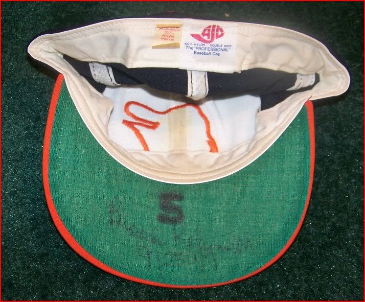
Notice the tag inside the cap,"100% Nylon". Looks like they were 30 years ahead of New Era in using all synthetic fabric for their caps.
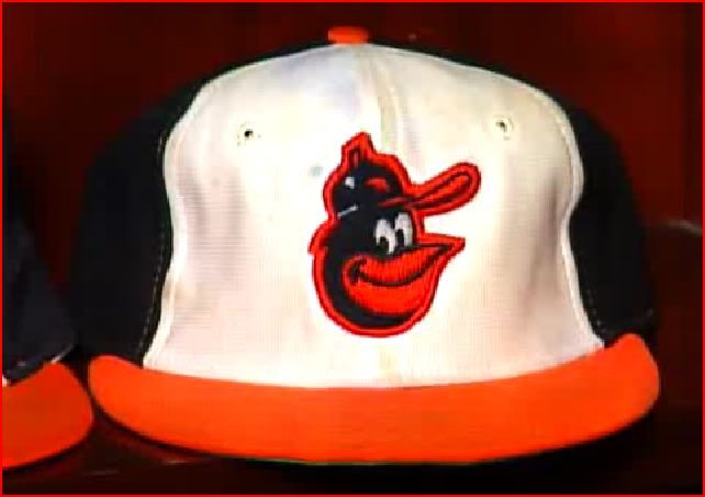
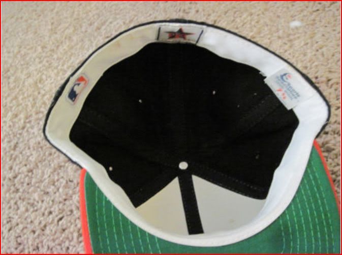
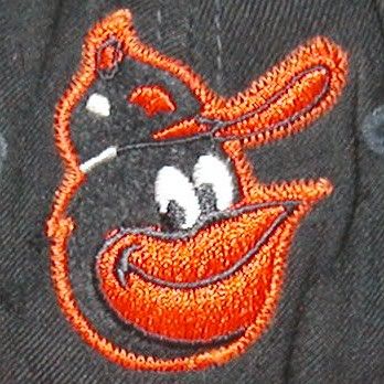
All the '77-'88 caps are made by New Era, and everything seems pretty consistent with this example:
Except for Jim Palmer's cap:
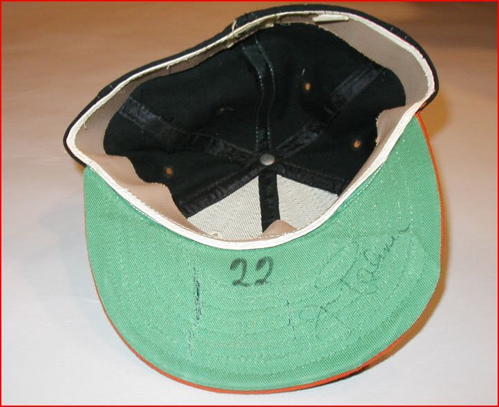
Notice the material that makes up the white panels is smoother and looks more natural. He's also got a leather headband in his cap, while the rest of the caps have cloth. The question is, did New Era custom make Palmer's cap with the leather headband, or did a different company make them?
I once found a Sports Specialties version of this cap. Sports Specialties made pro cap models for at least a dozen or so teams in the eighties and nineties, but I'm not sure if the O's actually wore them on the field:
Here's another oddball cap that is listed as belonging to Doug Decinces 1977-78:
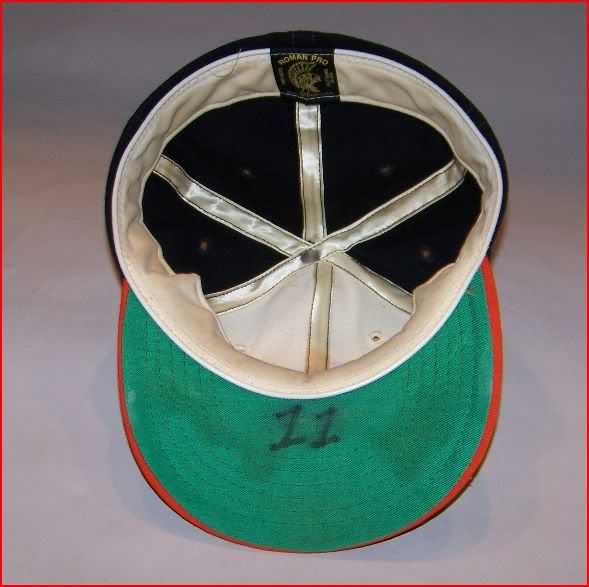
It's made by Roman Pro. Notice that it's the '66 bird logo, but with the black button on top of the birds hat, instead of orange one. In my first post, I mentioned that the early Cooperstown Collection '66 cap replicas were correct, except for the black button on the birds cap. Well here's that same logo, but on the the '70's cap! What the hell!?
-
08-16-2011, 12:51 AM #7Junior Member
- Join Date
- Aug 2011
- Posts
- 20
Re: A Study of the Baltimore Orioles Cartoon Bird Cap Logos
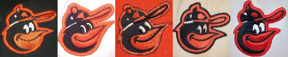
So to sum up my findings thus far, here are all the cartoon birds featured on the black, '66-'74 cap:
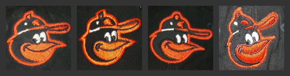
L-R:
1. This seems to be the most common bird seen on this cap. Made by Wilson.
2. KM Pro version of the bird. (I didn't realize there was a difference before)
3. This is the bird most commonly seen on the '75-'76 cap, but tilted up. Made by Wilson.
4. Most commonly seen on the '77-'88 caps. Made by Wilson
Here are the birds seen on the '75-'88 caps:
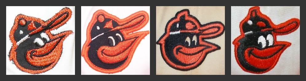
L-R:
1. '75-'76 bird, donned both white and alternate orange paneled caps. Made by AJD.
2. Another variation of the same bird. The design seems about the same besides the materials and technique used to sew. Made by AJD.
3. Roman Pro version. Note that it's the same as the KM Pro version, except for the black button on the birds cap.
4. New Era version, seen on most merchandise today, but usually the orange logo on the birds cap is colored white.
-
08-16-2011, 12:51 AM #8Junior Member
- Join Date
- Aug 2011
- Posts
- 20
Re: A Study of the Baltimore Orioles Cartoon Bird Cap Logos
[quote name='kcchiefsfan' timestamp='1312763487' post='1610141']
Wow this is one of the best threads since the Brooklyn dodgers logo one. I've learned alot, it is interesting to see all of the different variations of the same logo! Thanks Trevell NDwas and others. :grin:
[/quote]
Thanks kcchiefsfan. I remember reading that Brooklyn Dodgers thread a while back and wishing there was someone who would give that same treatment to the Orioles cartoon bird logo!
I wouldn't call myself a serious cap collector by any means, but it's always cool to have a few caps on hand just for whenever. It just ticks me off when I see major inaccuracies with historic caps. I don't expect a stitch by stitch replica, necessarily (although that would be nice), but at least get the logo right. That's the most important part of the cap!
-
08-16-2011, 12:52 AM #9Junior Member
- Join Date
- Aug 2011
- Posts
- 20
Re: A Study of the Baltimore Orioles Cartoon Bird Cap Logos
I dug out a couple books to reference at home. I've got a Topps book of all the Orioles team baseball card sets through 1987. The cards on the pages are shrunk down to about a quarter of the size of an actual card, but of all the clear photo cards that have the players wearing the black crowned '66-'74 cap, this is the only version of the logo that I see:
I've also got The Orioles Encyclopedia. Not exactly filled with a ton of photos, but of the dozen plus or so pictures of players wearing that cap, I only see that same logo.
So I think it's safe to say that this is THE logo of the '66-'74 cap, made by Wilson Sporting Goods. So if they put out a repro of the '66-'74 cap, with that logo, I would be perfectly happy with it.
It's still interesting that all the versions of the Cartoon Bird logo made it onto the black crowned cap. I'm guessing that the other logos we've seen on this cap were some sort of prototypes:
or in the case of this logo, samples from the KM Pro cap company:
It would be interesting to know what company had exclusive rights to the Orioles caps during those years. My guess would be Wilson, since the majority of the hats from that era seem to be made by them.
I just found out through this site: ballcapblog that Wilson caps were manufactured by New Era, and most of the embroidery was done by under private label by Roman Pro.
Don't know if this was the case for this specific cap, but interesting info nonetheless.
-
08-16-2011, 12:53 AM #10Junior Member
- Join Date
- Aug 2011
- Posts
- 20
Re: A Study of the Baltimore Orioles Cartoon Bird Cap Logos
Here's a pretty good video by Tom Davis on O's hat history:
http://www.masnsports.com/ml/video.php?show_id=40418
It's pretty comprehensive, but I'm not sure this logo:
Was used from '76 on.
Going by my Topps Orioles book, I don't see that hat come up until the 1979('78 season)set, and it's only on two cards that I can tell. It's not until the 1980('79 season) set on, that you see every single player with that logo.
This one isn't even mentioned in the video, but in The Orioles Encyclopedia, there is one picture with this logo:
It's worn by Don Stanhouse, who was on the team '78-'79, and '82.
There are a few cards in the '79('78 season) Topps set, that look like they might have that logo, but it's hard to tell.
The logo that Tom says was used in '75 only, can be seen on caps through the '79('78 season) set.
There seems to be some possible overlap in the late '70's, which makes trying to figure this out a little confusing.
All this information leads me to believe that the following could possibly be the correct chronology for the the Orioles on-field Cartoon Bird logo:
L-R:
1. 1966-1974 - This is the only logo I've seen the players wear in pictures. Made by Wilson Sporting Goods.
2. 1975-1978 - Logo used on both white and orange panel('75-'76 only)alternate. Made by AJD.
3. 1975-1976 - Logo used on both white and orange panel alternate. Made by AJD.
4. 1978 - Made by Roman Pro.
5. 1979-1988 - Made by New Era(possibly Sports Specialties as well)
Well there it is, if anyone can add to this with player or team photos for more clarification, it would be great!


 Reply With Quote