


Results 1 to 6 of 6
Thread: Bo Jackson Rookie Jersey on Ebay
-
08-16-2012, 01:09 PM #1Senior Member

- Join Date
- Aug 2005
- Posts
- 446
Bo Jackson Rookie Jersey on Ebay
HI does any Royals experts have any thoughts on this jersey:
http://www.ebay.com/itm/Bo-Jackson-G...11%26rk%3D2%26
Thanks!
-
08-16-2012, 01:46 PM #2Senior Member
- Join Date
- May 2010
- Posts
- 526
Re: Bo Jackson Rookie Jersey on Ebay
No expert, but shouldn't the name be vertically arched?
-
08-16-2012, 02:33 PM #3Senior Member
- Join Date
- Aug 2005
- Posts
- 446
Re: Bo Jackson Rookie Jersey on Ebay
That's what I thought, thanks for validating my opinion.
-
08-17-2012, 08:31 PM #4Senior Member
- Join Date
- Sep 2007
- Posts
- 181
Re: Bo Jackson Rookie Jersey on Ebay
You are correct it should look like this: Originally Posted by slab0meat

 __________________________________________________ _______________
Always looking for any Edgardo Alfonzo game used stuff!
cfiguer5@yahoo.com
-
08-19-2012, 12:13 PM #5Senior Member
- Join Date
- Mar 2012
- Posts
- 194
Re: Bo Jackson Rookie Jersey on Ebay
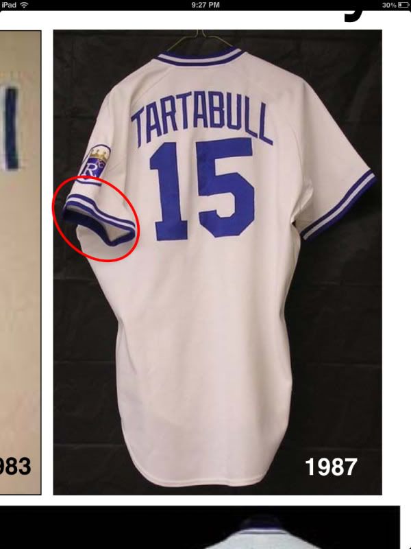
The lettering for the Tartabull example above is from 1987. In 1986, the lettering was thicker. A different, wider font was used for jersey numbers in 1986. Letters were also spaced further apart in 1986. The eBay jersey, with block lettering, is consistent with the home 1986 jersey sold by Leland's, and is consistent with the lettering in the press photo for sale on eBay. You can see how the right leg in the letter 'A' matches up nicely. So for at least one road jersey, the letters appear to be block cut and not arched.
Tagging is consistent with other 1986 home jerseys I have seen, except for a Charlie Sheen road Bo Jackson jersey. This jersey, to complicate mattress, had arched-cut lettering. The tagging for that jersey makes me a little nervous.
From what I understand, the Royals were not the most consistent team in lettering style during this era. I have seen multiple Royals jerseys from 1986 said to be game worn with arched lettering.
Bo Jackson was a September call-up. Attention to jersey name detail may not have been of much concern during this time of roster expansion.
Bo Jaskson photo - block lettering:
http://www.ebay.com/itm/1986-Press-P...item3a745160f8
Bo Jackson road rookie jersey:
http://www.lelands.com/Auction/Aucti...-Rookie-Jersey
-
08-21-2012, 08:09 PM #6Banned
- Join Date
- Apr 2009
- Posts
- 8,901
 Re: Bo Jackson Rookie Jersey on Ebay
Your comments on the NOB font incosnsitency are very sensible and likely the case. The Cubs did the same thing even earlier during the season in the 1980s....vertical arches were the norm, but newcomers, even in midseason, often got a straight arch. This was pre-1987. Originally Posted by esquiresports
Re: Bo Jackson Rookie Jersey on Ebay
Your comments on the NOB font incosnsitency are very sensible and likely the case. The Cubs did the same thing even earlier during the season in the 1980s....vertical arches were the norm, but newcomers, even in midseason, often got a straight arch. This was pre-1987. Originally Posted by esquiresports
The difgferences in fonts between the Bo and the Tartabull can be summed up by IDing the manufacturers. The Royals (like the Cubs) wore Wilson inn 1986 and Rawlings in 1987.
Dave Miedema

 Reply With Quote

