


Results 1 to 10 of 34
Thread: New Louisville Slugger Design
-
12-04-2012, 01:13 PM #1Senior Member

- Join Date
- Apr 2010
- Posts
- 105
New Louisville Slugger Design
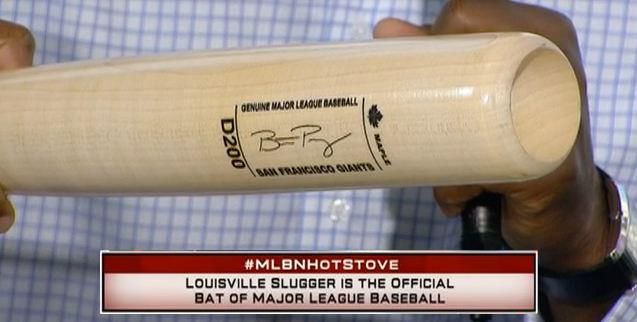
Louisville has changed the design of their bats for 2013. Per usual, I'm not a fan of change, but this will probably, eventually grow on me.
http://mlb.mlb.com/video/play.jsp?co...15157&c_id=mlb
-Desi
-
12-04-2012, 01:18 PM #2Senior Member
- Join Date
- Jan 2008
- Posts
- 474
Re: New Louisville Slugger Design
Wow...looks like my 1st grader could have done better. Like the original poster stated, it may eventually grow on me.
-
12-04-2012, 01:31 PM #3Senior Member
- Join Date
- Aug 2005
- Posts
- 2,943
Re: New Louisville Slugger Design
what the video. some interesting decoding symbols on the other side of the barrell. Originally Posted by happyyoungster
 Regards,
Joel S.
joelsabi @ gmail.com
Wanted: Alex Rodriguez Game Used Items and other unique artifacts, 1992 thru 1998 only. From High School to Early Mariners.
-
12-04-2012, 03:09 PM #4Senior Member
- Join Date
- Dec 2007
- Posts
- 3,609
 Re: New Louisville Slugger Design
The "That's aftermarket" line at the end was priceless. Originally Posted by Desi
Re: New Louisville Slugger Design
The "That's aftermarket" line at the end was priceless. Originally Posted by Desi
 Les Zukor
bagwellgameused@gmail.com
Collecting Jeff Bagwell Cleats, Jerseys, & Other Items
http://www.bagwellgameused.com
(617) 682-0408
-
12-04-2012, 04:43 PM #5Senior Member
- Join Date
- Jul 2009
- Posts
- 823
Re: New Louisville Slugger Design
I hate to see them change things this much. Not a big fan of the framed signature.
Collecting Cardinals jerseys and bats, with a focus on Yadier Molina, Matt Holliday, and Adam Wainwright.
Tyler
flotaboys@hotmail.com
-
12-04-2012, 04:59 PM #6Senior Member
- Join Date
- Dec 2005
- Posts
- 1,579
Re: New Louisville Slugger Design
Yeah, the retail bats on ebay look the same. But the retail versions were out before hand....
-
12-04-2012, 08:08 PM #7Senior Member
- Join Date
- Apr 2009
- Posts
- 441
Re: New Louisville Slugger Design
Is this real? Would LS really change this radically? Wow not a fan
-
12-04-2012, 09:26 PM #8Senior Member
- Join Date
- Nov 2008
- Posts
- 894
 Re: New Louisville Slugger Design
Coming from a designer who does product branding, I think this design was a step backwards and sad to see. They remind me of the "Turn Ahead the Clock" uniforms... and not in a good way.
The old LVS had tradition, this looks like it's aping the worst features of the competition... It would have been a creative goldmine to rework these bats for the future while retaining the long LVS tradition and this is what they came up with?
These look like a cross between a commemorative bat and some of the modern bats (like Trinity or X-Bat) that haven't really found a specific branding look yet and are just bland. Also, nothing looks burned-in, I'm assuming it's all foil stamped or screened on now...
I like the idea of the icons showing what the bat specs are, but think this should have been on the knob or the barrel end, no reason to emphasize these.
It seems like they're making these unnaturally futuristic with the icons and the overall framed look. I'm assuming someone made a comment that the old bats looked too old or outdated and LVS went too far in the other direction.
-
12-04-2012, 09:31 PM #9Senior Member
- Join Date
- Dec 2009
- Posts
- 835
Re: New Louisville Slugger Design
I think it's hideous and unfortunate. The "Genuine Major League Baseball" line is completely unnecessary. It's more of a defacing than a rebranding...
- CINCINNATI REDS/JOEY VOTTO BATS
Email: rdeversole@gmail.com Twitter: @dugoutrelics
-
12-04-2012, 09:41 PM #10Senior Member
- Join Date
- May 2006
- Posts
- 1,703
Re: New Louisville Slugger Design
What the heck is that crap?


 Reply With Quote


