-
-
Re: Life's ugliest baseball uniforms
P.S. I forgot that was the same year of the Ugly Logo Patch!Comment
-
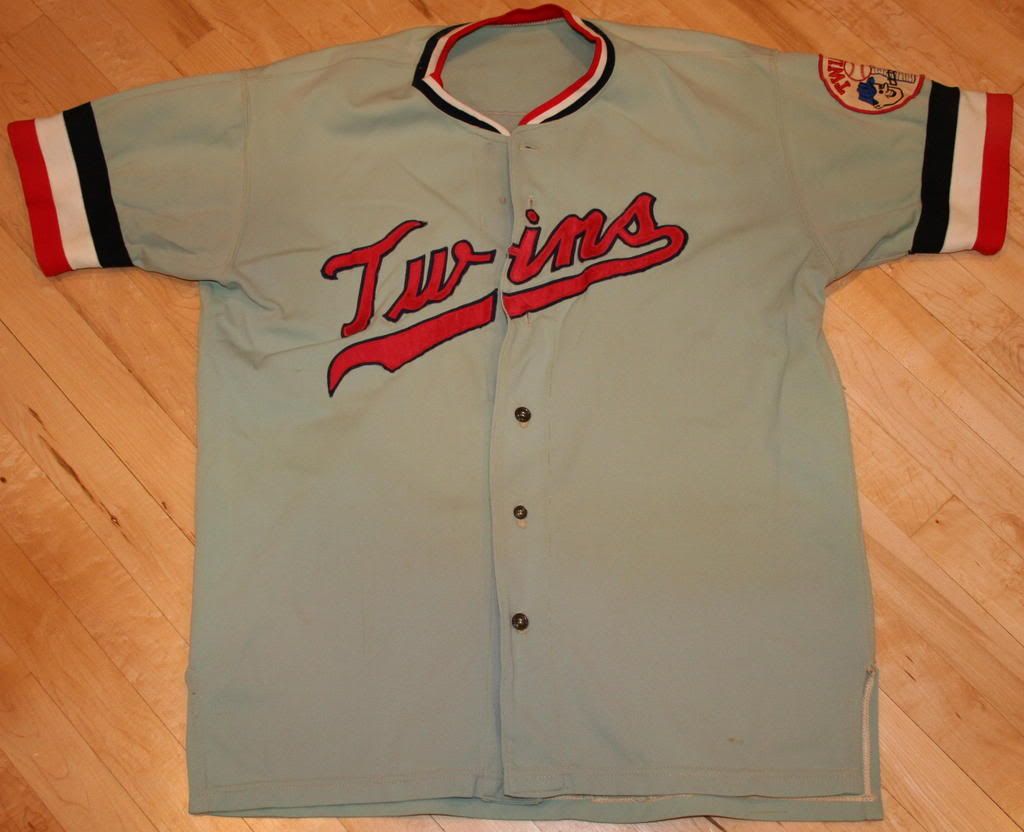
Re: Life's ugliest baseball uniforms
I actually like that 1971 Twins road jersey. That being said, I would have to go with the Padres or Pirates yellow jerseys. Those were just bad. I can't believe no one mentioned the late 70's Giants orange pull over jerseys.Comment
-
Re: Life's ugliest baseball uniforms
I'll post my opinion....and that is I think whoever wrote that article must not be a baseball fan....that or is a tool.
I only found 3 of the 12 uniforms shown to be "ugly"....by my taste. The 73 Pirates, 74 Padres and the 77 Indians.
The 85 Mets ugly? Please....that's a classic uniform to me. I have an 85-86 Gooden Authentic that I LOVE to sport around town.
I guess beauty really is in the eye of the beholder.
And....where were the White Sox with the "Nair wear short shorts!"?Comment
 Tweet
Tweet
 I knew you could save me!!

Comment