
 Tweet
Tweet
The new Arizona State football uniform:
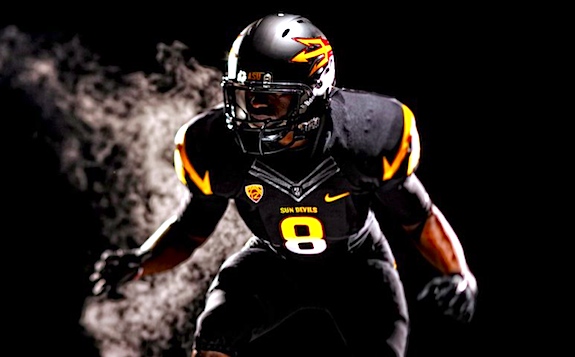
It looks pretty sharp to me. What do Forum members think?
Dave Miedema
It looks pretty sharp to me. What do Forum members think?
Dave Miedema

 Arizona's recent pants have screen printed art on the side and I think it looks like garbage. Not a big fan of screen printing.


Comment