-
Re: A Study of the Baltimore Orioles Cartoon Bird Cap Logos
My favorite team, the Baltimore Orioles, haven't had a winning season since 1997, so lately I've shifted my attention to my favorite logo of all time, The Cartoon Bird. That friendly, smiling, feathered character that perched atop the caps of the Orioles from 1966-1988. But don't let his friendly smirk and soft feathers fool you, he will show no mercy.
During The Birds 23 year tenure, the O's had 19 winning seasons, including 8 Playoff and 6 World Series appearances. The Orioles were the winningest team in all of baseball during the span that The Cartoon Bird donned their caps. If they weren't in it, they were damn close.
OK, enough with Baltimore's long gone winning baseball history, lets get to the actual cap and it's famous logo:
There are actually 3 different versions of The Cartoon Bird cap logo. There are only 2 posted on this site, which is what prompted me to write this post.
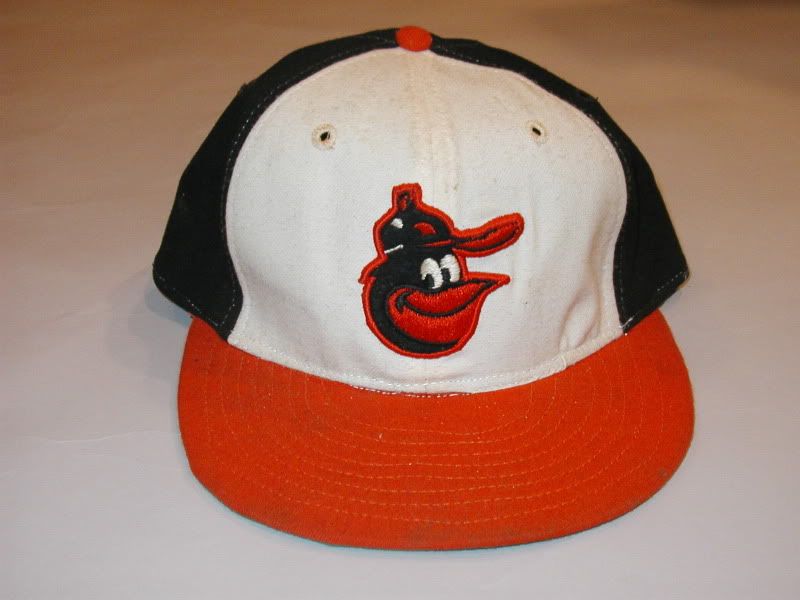
First, the 1966 cap:
Classic Cartoon Bird logo on black hat, with orange bill. They used this cap from 1966-1974. It is represented on this site with this beautiful rendition:
The only difference I notice between the actual cap logo and this image, is the button on top of the cap is rounded off at the top. On the actual cap, the button is angular, almost a triangle shape.
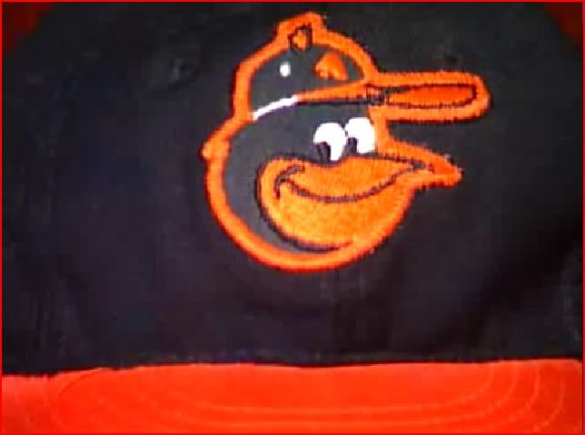
I've seen this bird used on past replica hats, but for some reason the button on the birds cap was left black and not colored orange. Here is a KM Pro/Mitchel & Ness replica of this cap:
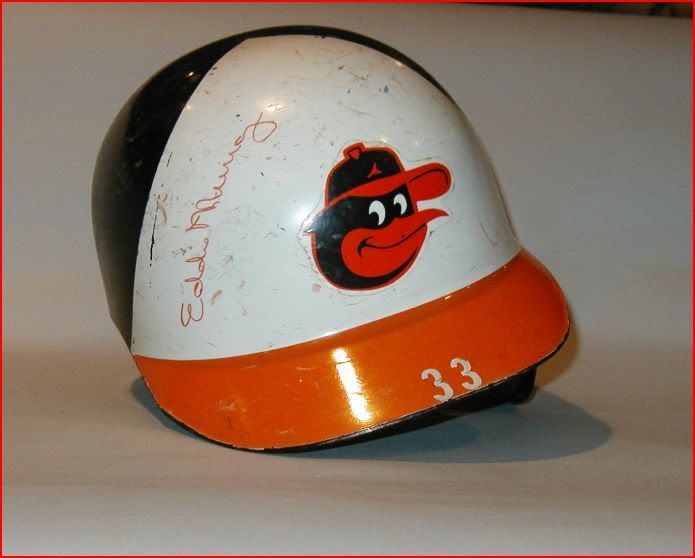
In 1975, the Orioles added white panels to the front of the hat and introduced a new bird. The forgotten Cartoon Bird:
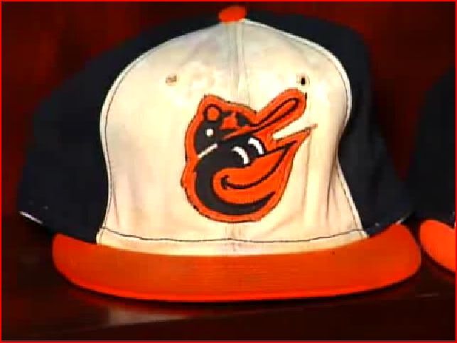
The birds beak is tilted higher upward and there are slight differences in the eyes, button and logo on his cap. There is also black stitching around the white panels.
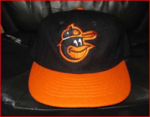
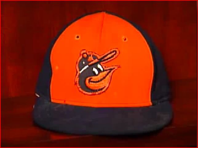
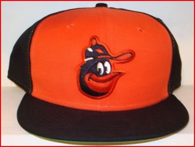
They also used this bird on an orange paneled cap that was used as an alternate from 1975-1976:
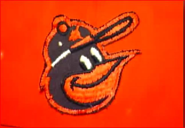
I've never seen this bird represented correctly on any replica caps. He's represented on this site with this image, which is not also not correct:
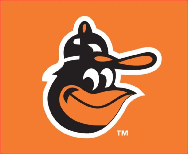
Moving onto 1977, they continued with the white panels (minus the black stitching) and reduced the size of the bird:
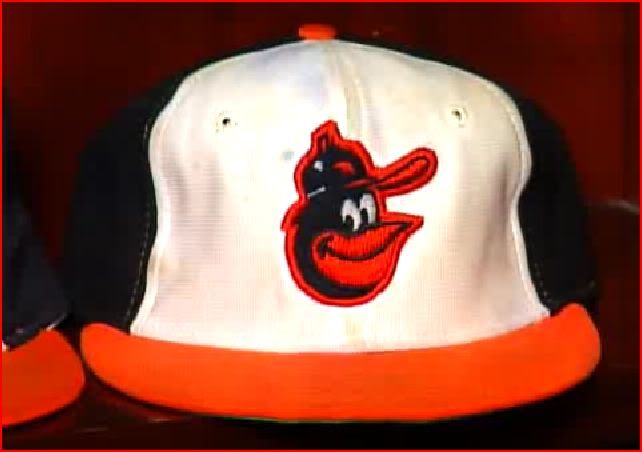
The O's would wear this cap through the 1988 season.
Here's the image from the site:
Everything looks good, except for the logo on the birds cap, which is supposed to be orange, not white. I often see replicas, with the white logo instead of orange, as well.
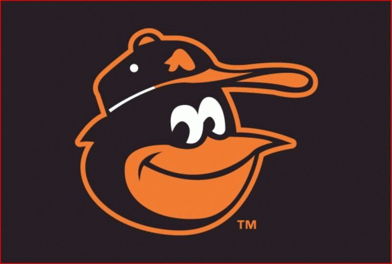
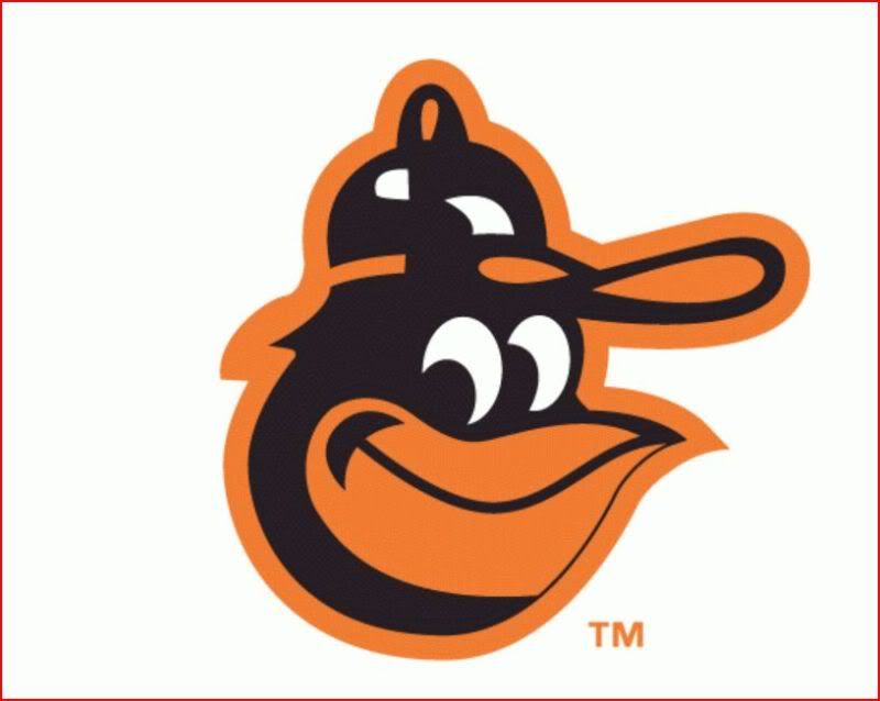
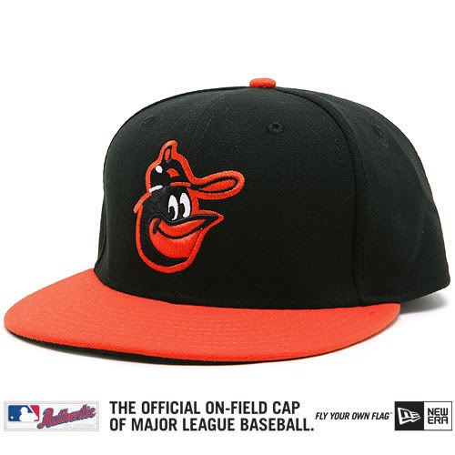
This is the bird we see on all replica caps and merchandise today. It has taken the place of the '66-'74 bird, as illustrated by this recent, authentic, on-field, turn back the clock model:
It's also used on the '75-'76 orange panel replica:
Well, there you have it, everything I know about the 3 variations of The Cartoon Bird. Rumor has it that the Orioles will bring him back on the caps officially next year. I wonder which version they will use?Leave a comment:
-
A Study of the Baltimore Orioles Cartoon Bird Cap Logos
Hey everyone,
I originally created this thread over at Chris Creamer's Sports Logos site, but I thought I'd post highlights of it here, to see if anyone has any extra info to add.
Here's the link to the original thread:
http://boards.sportslogos.net/index....pic=81874&st=0
One more thing to add, I learned a few things as I was adding to the original thread, so there is info in the first post that is corrected in later posts. I'm too lazy to re-organize everything, so I'm just going to post the main posts here, in the order that they were posted.
Leave a comment: