Re: A Study of the Baltimore Orioles Cartoon Bird Cap Logos
Great research! I've been wanting to do this same kind of examination of the STL logo on Cardinals' caps. It's amazing how much it has changed, often subtly. Thanks for sharing!
A Study of the Baltimore Orioles Cartoon Bird Cap Logos
Collapse
X
-
Re: A Study of the Baltimore Orioles Cartoon Bird Cap Logos
Bring it back??... Wieters already has... he wears a Black / White / Orange helmet with the cartoon Bird under his catchers maskLeave a comment:
-
Re: A Study of the Baltimore Orioles Cartoon Bird Cap Logos
Great job guys...bring back the cartoon bird!!Leave a comment:
-
Re: A Study of the Baltimore Orioles Cartoon Bird Cap Logos
Well, I guess that Orioles baseball card book I have to reference, with the 1/4 size pics, really isn't detailed enough to tell which logo is being worn. I just checked out a few actual cards from a dealer friend of mine and discovered this on a couple '75('74 season) cards:
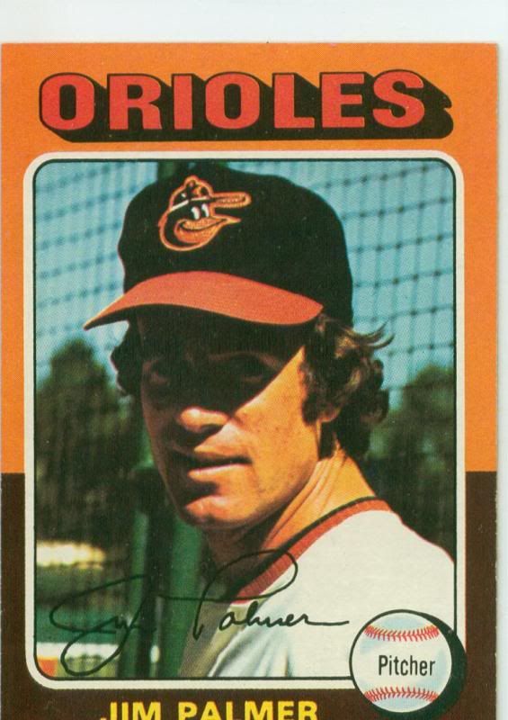
It's Jim Palmer with the bird that would later be seen next year with the up turned beak against the white panels.
So maybe they used this logo for the last year of the black crowned caps and in '75, AJD used it in the transition to their white and orange panel caps?
Checked a couple cards from the '74('73 season)set, and it appears to be the more common '66 bird:
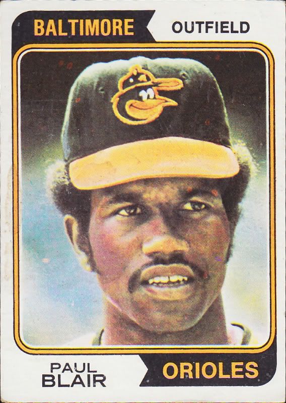
Leave a comment:
-
Re: A Study of the Baltimore Orioles Cartoon Bird Cap Logos
Why does the new era hat logo look like the beanie baby CAW who keep in mind is a CROW lolLeave a comment:
-
Re: A Study of the Baltimore Orioles Cartoon Bird Cap Logos
[quote name='phutmasterflex' timestamp='1312471846' post='1607746']

This is a New Era re-release that I bought. It doesn't have that New Era logo on the side and the back doesn't have the MLB logo. It's my favorite Orioles cap. This is the 1983 World Series one if I recall.
[/quote]
That's the one cartoon cap repro out there that is pretty much an exact replica.
Here's the actual game worn version, also made by New Era:

Leave a comment:
-
Re: A Study of the Baltimore Orioles Cartoon Bird Cap Logos
[quote name='Jungle Jim' timestamp='1312464800' post='1607694']
When you consider the batting helmet logos the Orioles used during that era, there are even more differences. Eddie Murray's 1978 Topps card shows him wearing a helmet where the bird has a white line in its beak rather than a black line. Also, the size of the white panel on the helmets changed at some point (although that's not really logo related.)
Rather than repeating myself, I'll link to a post I made about it back in April...
http://boards.sports...dpost&p=1526945
[/quote]
Aw man.. the helmets are a whole other mess, but in my research, I think I may have found out why. It's because some of the helmet logos are hand painted, while others were affixed with a decal.
The painted logos ranged from really good:
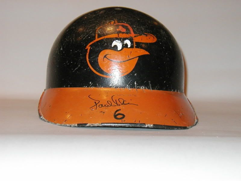
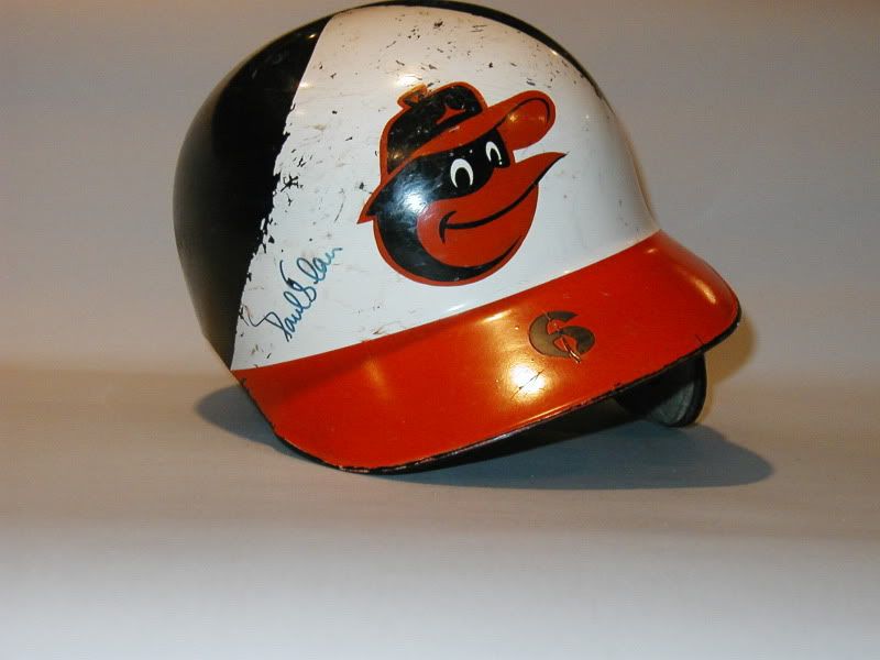
To really bad:
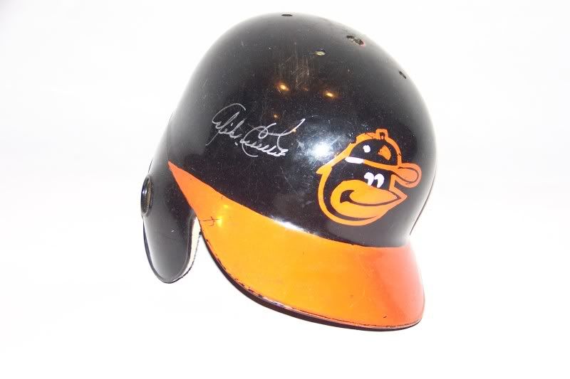
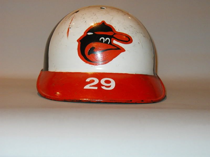
And here's a helmet with the decal:
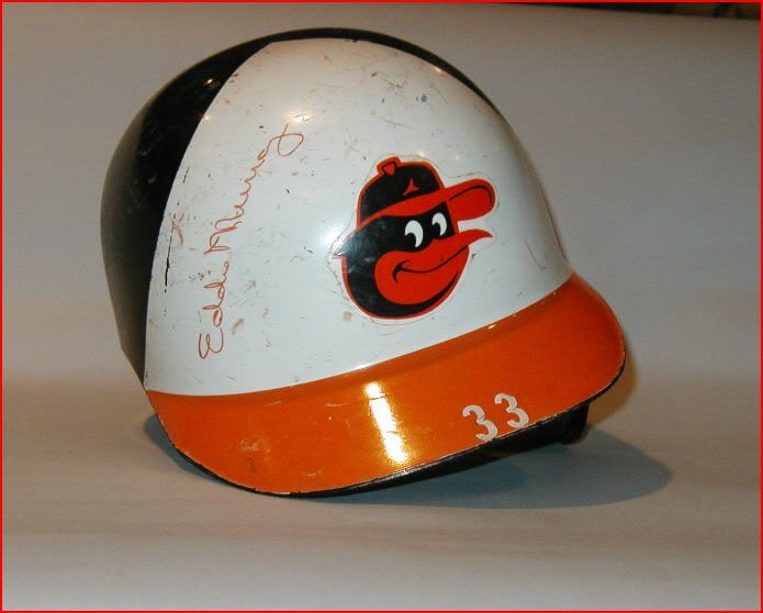
Leave a comment:
-
Re: A Study of the Baltimore Orioles Cartoon Bird Cap Logos
[quote name='Gothamite' timestamp='1312856005' post='1610986']
One thing that might be worth considering is that some players might have continued to wear old caps after the team changed suppliers. That's a problem I had doing my Brooklyn Dodger research - maddening.
Great job on the recap! I never realized that there were so many variations of this logo.
[/quote]
Thanks Gothamite. I did that into consideration. Also, most of the baseball card pictures were taken during Spring Training back then, so that's another thing to consider when using them as a reference.
Your Brooklyn Dodger "B" thread was sort of an inspiration for this thread. I share your frustrations on wishing New Era/Cooperstown would get these throwbacks right!
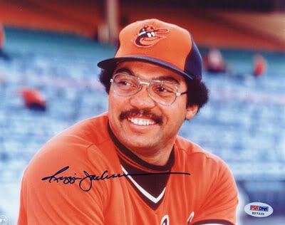
Here's a cool pic of Reggie Jackson sportin' the '75-'76 alternate orange panel AJD cap:
And here's the crappy remake by New Era/Cooperstown:
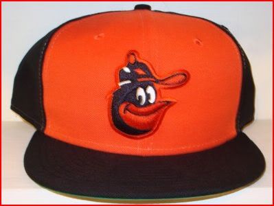
I wouldn't expect New Era to reproduce a 100% Nylon version of this cap to exact specifications, as it was originally made, but like I said earlier, at least get the logo right.
Here's an American Needle version that's even worse!
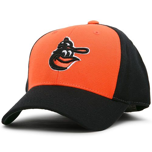
From the description:
"Own a little piece of history with American Needle's Baltimore Orioles 1975-76 Alternate Cooperstown Cap, a precise replica of what the legendary pros once wore."
Haha! Yeah right!Leave a comment:
-
Re: A Study of the Baltimore Orioles Cartoon Bird Cap Logos
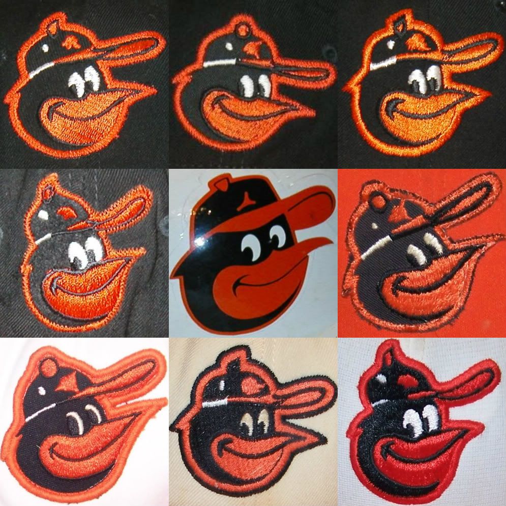
...and just for fun, the whole dang family!!!
Leave a comment:
-
Re: A Study of the Baltimore Orioles Cartoon Bird Cap Logos
Here's a pretty good video by Tom Davis on O's hat history:
It's pretty comprehensive, but I'm not sure this logo:
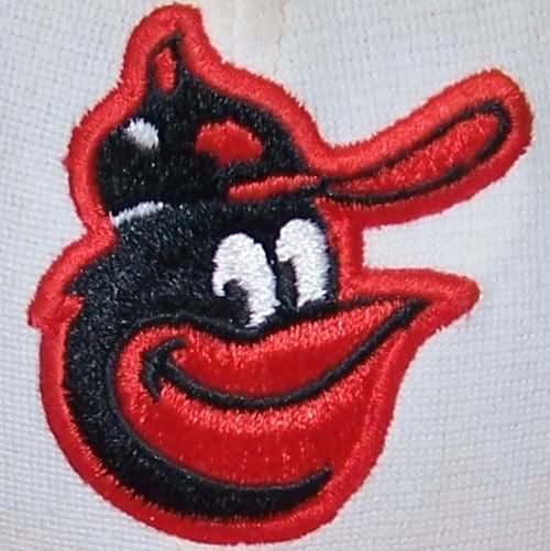
Was used from '76 on.
Going by my Topps Orioles book, I don't see that hat come up until the 1979('78 season)set, and it's only on two cards that I can tell. It's not until the 1980('79 season) set on, that you see every single player with that logo.
This one isn't even mentioned in the video, but in The Orioles Encyclopedia, there is one picture with this logo:
It's worn by Don Stanhouse, who was on the team '78-'79, and '82.
There are a few cards in the '79('78 season) Topps set, that look like they might have that logo, but it's hard to tell.
The logo that Tom says was used in '75 only, can be seen on caps through the '79('78 season) set.
There seems to be some possible overlap in the late '70's, which makes trying to figure this out a little confusing.
All this information leads me to believe that the following could possibly be the correct chronology for the the Orioles on-field Cartoon Bird logo:

L-R:
1. 1966-1974 - This is the only logo I've seen the players wear in pictures. Made by Wilson Sporting Goods.
2. 1975-1978 - Logo used on both white and orange panel('75-'76 only)alternate. Made by AJD.
3. 1975-1976 - Logo used on both white and orange panel alternate. Made by AJD.
4. 1978 - Made by Roman Pro.
5. 1979-1988 - Made by New Era(possibly Sports Specialties as well)
Well there it is, if anyone can add to this with player or team photos for more clarification, it would be great!Leave a comment:
-
Re: A Study of the Baltimore Orioles Cartoon Bird Cap Logos
I dug out a couple books to reference at home. I've got a Topps book of all the Orioles team baseball card sets through 1987. The cards on the pages are shrunk down to about a quarter of the size of an actual card, but of all the clear photo cards that have the players wearing the black crowned '66-'74 cap, this is the only version of the logo that I see:
I've also got The Orioles Encyclopedia. Not exactly filled with a ton of photos, but of the dozen plus or so pictures of players wearing that cap, I only see that same logo.
So I think it's safe to say that this is THE logo of the '66-'74 cap, made by Wilson Sporting Goods. So if they put out a repro of the '66-'74 cap, with that logo, I would be perfectly happy with it.
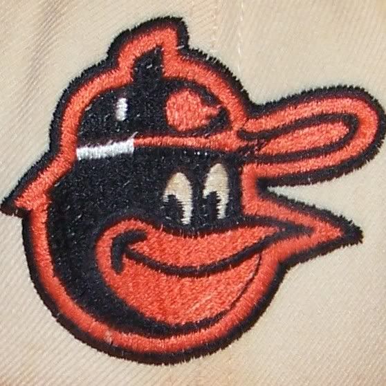
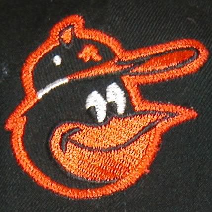
It's still interesting that all the versions of the Cartoon Bird logo made it onto the black crowned cap. I'm guessing that the other logos we've seen on this cap were some sort of prototypes:
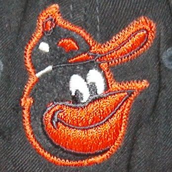
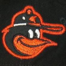
or in the case of this logo, samples from the KM Pro cap company:
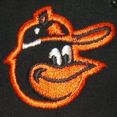
It would be interesting to know what company had exclusive rights to the Orioles caps during those years. My guess would be Wilson, since the majority of the hats from that era seem to be made by them.
I just found out through this site: ballcapblog that Wilson caps were manufactured by New Era, and most of the embroidery was done by under private label by Roman Pro.
Don't know if this was the case for this specific cap, but interesting info nonetheless.Leave a comment:
-
Re: A Study of the Baltimore Orioles Cartoon Bird Cap Logos
[quote name='kcchiefsfan' timestamp='1312763487' post='1610141']
Wow this is one of the best threads since the Brooklyn dodgers logo one. I've learned alot, it is interesting to see all of the different variations of the same logo! Thanks Trevell NDwas and others. :grin:
[/quote]
Thanks kcchiefsfan. I remember reading that Brooklyn Dodgers thread a while back and wishing there was someone who would give that same treatment to the Orioles cartoon bird logo!
I wouldn't call myself a serious cap collector by any means, but it's always cool to have a few caps on hand just for whenever. It just ticks me off when I see major inaccuracies with historic caps. I don't expect a stitch by stitch replica, necessarily (although that would be nice), but at least get the logo right. That's the most important part of the cap!Leave a comment:
-
Re: A Study of the Baltimore Orioles Cartoon Bird Cap Logos
So to sum up my findings thus far, here are all the cartoon birds featured on the black, '66-'74 cap:

L-R:
1. This seems to be the most common bird seen on this cap. Made by Wilson.
2. KM Pro version of the bird. (I didn't realize there was a difference before)
3. This is the bird most commonly seen on the '75-'76 cap, but tilted up. Made by Wilson.
4. Most commonly seen on the '77-'88 caps. Made by Wilson
Here are the birds seen on the '75-'88 caps:

L-R:
1. '75-'76 bird, donned both white and alternate orange paneled caps. Made by AJD.
2. Another variation of the same bird. The design seems about the same besides the materials and technique used to sew. Made by AJD.
3. Roman Pro version. Note that it's the same as the KM Pro version, except for the black button on the birds cap.
4. New Era version, seen on most merchandise today, but usually the orange logo on the birds cap is colored white.Leave a comment:
-
Re: A Study of the Baltimore Orioles Cartoon Bird Cap Logos
The '75-'76 caps were made by a company called AJD. Here are two different versions of the same logo:
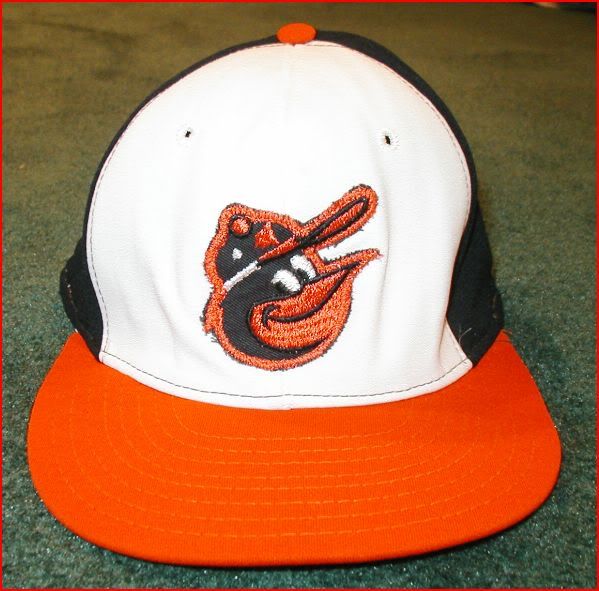
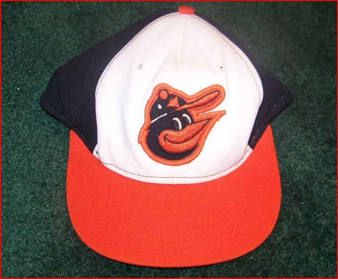
The first one looks like a patch sewn on, while the second one is much smoother and refined, although that might be a patch too.
In a quick Google search, the only info I could find about AJD is that it was based in Richmond, Virginia, at one time:
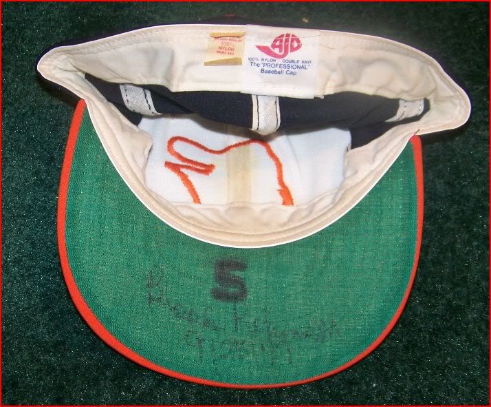
Notice the tag inside the cap,"100% Nylon". Looks like they were 30 years ahead of New Era in using all synthetic fabric for their caps.
All the '77-'88 caps are made by New Era, and everything seems pretty consistent with this example:
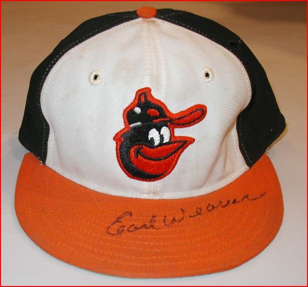
Except for Jim Palmer's cap:
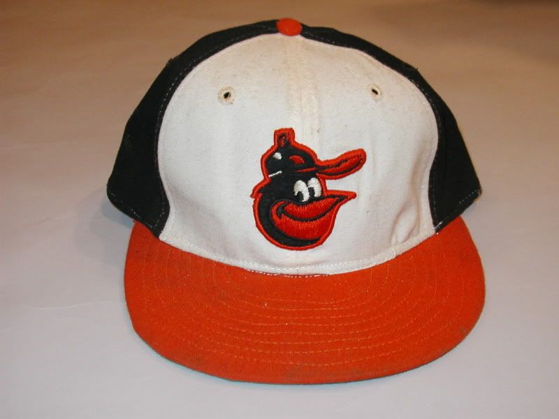
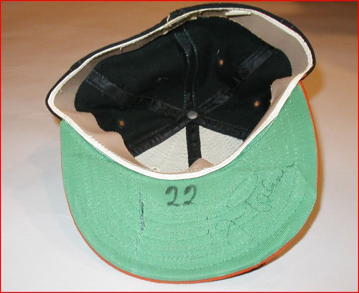
Notice the material that makes up the white panels is smoother and looks more natural. He's also got a leather headband in his cap, while the rest of the caps have cloth. The question is, did New Era custom make Palmer's cap with the leather headband, or did a different company make them?
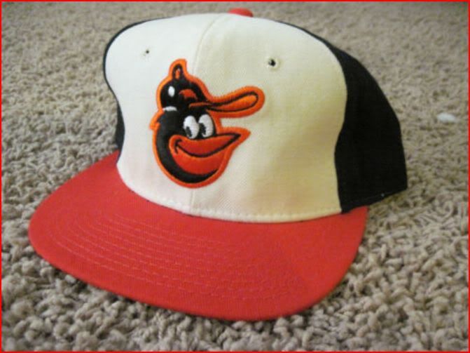
I once found a Sports Specialties version of this cap. Sports Specialties made pro cap models for at least a dozen or so teams in the eighties and nineties, but I'm not sure if the O's actually wore them on the field:
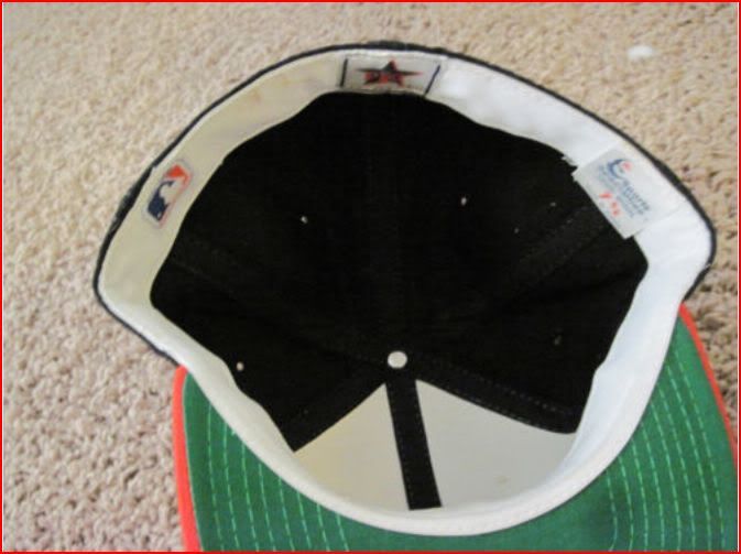
Here's another oddball cap that is listed as belonging to Doug Decinces 1977-78:
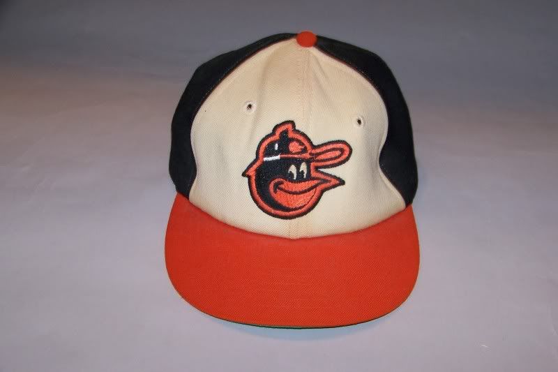
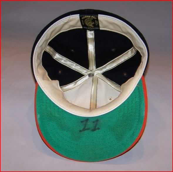
It's made by Roman Pro. Notice that it's the '66 bird logo, but with the black button on top of the birds hat, instead of orange one. In my first post, I mentioned that the early Cooperstown Collection '66 cap replicas were correct, except for the black button on the birds cap. Well here's that same logo, but on the the '70's cap! What the hell!?Leave a comment:
-
Re: A Study of the Baltimore Orioles Cartoon Bird Cap Logos
[quote name='NDwas' timestamp='1312482354' post='1607884']
As a die-hard Orioles fan since birth, I've always wondered why there were so many inconsistencies between the bird logos.[/quote]
Good post, NDwas. I never noticed those details in the swinging bird. With the current cartoon cap logo, I figured they were trying to standardize and just narrow it down to one bird face, but then you see the bird they release officially, on the new, authentic/on-fild, TBTC cap and it's different still.
Furthering my research on the actual cap logos, I came across an auction site that has a ton of game used O's gear from the '50's through present:
Just type 'orioles' or 'orioles hat' into their search engine and a bunch of stuff will come up.
Of the 22 '66-'74 caps, 21 are made by Wilson and 1 is made by KM Pro.
The hats are all uniform and consistent with this logo:
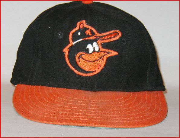
Except for this one:
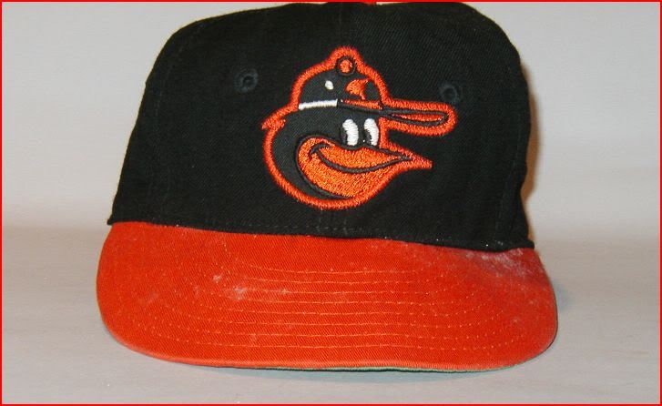
Notice it's the '75 logo, but his beak isn't turned up. This cap is made by Wilson.
And this one:
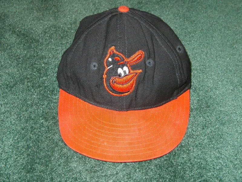
What's the late '70's bird doing on the '66 cap?! Maybe you could say the new TBTC cap isn't incorrect after all? It's listed as belonging to George Staller. He was the 1st base coach. This one is also made by Wilson.
So we have all 3 Cartoon Bird logos making their appearance on the '66-'74 cap!Leave a comment:

Leave a comment: